TRIYO Audit Trail: Tracking Email Communications
Product Strategy, UX Research, Wireframing, Prototyping, Usability, Accessibility, Design System.
Nov 2023 - Jan 2023
The Audit Trail function in the TRIYO Outlook Add-in helps users track email communications among task members for a specific task. This project aimed to improve the module's usability and align it with the Microsoft Fluent design language.
Overview
Background
TRIYO's Outlook Add-in Audit Trail
In 1971, the world's first email was sent, marking a significant milestone in the evolution of communication technology. Over the years, email has emerged as one of the most widely used methods of communication in the workplace.
TRIYO is dedicated to enhancing traditional email-based collaboration by improving its transparency, efficiency, and convenience across various business processes. TRIYO Outlook Add-in helps users create email-based tasks and tracks all emails.

I was part of the TRIYO Outlook Add-in project to enhance its Audit Trail function, which tracks and organizes all email communications among team members assigned to the same task.
The Challenge
Enhance financial professionals' productivity in a small add-in screen
The KYC (Know Your Client) process in capital markets encompasses collecting and verifying client information, assessing their financial background and risk profile, and monitoring their transactions. Its primary objective is to prevent financial crimes, such as money laundering and fraud, by establishing transparency in client interactions.
Financial institutions like RBC (Royal Bank of Canada) Capital Markets often rely on email for client outreach in their KYC processes, They enhance their KYC procedures with TRIYO Outlook add-in for task collaboration and email tracking.

After the first phase of this function launch, a post-launch survey revealed the need for enhancing the user experience of the Audit Trail Function.
In this second phase of the project, our challenge was to optimize the user experience and enhance their productivity and efficiency while work within the constraints of the limited add-in screen.
Current Audit Trial
My role
User Research & Ideation
Partnered with Design Lead and Design Co-op, I conducted user interviews and surveys to gain insights into the users’ needs and pain points, and translated these findings into actionable features.
Planning & Scope Definition
Working closely with the Product Manager, I defined the product scope, taking into account both customer goals and business objectives. I prioritized features for launch and beyond, negotiating trade-offs where necessary.
Design & Validation
I executed wireframes and prototypes, transforming the design into Fluent Design Language. By validating the design with users and stakeholders, I ensured that the final product met their needs and expectations.
The Approach
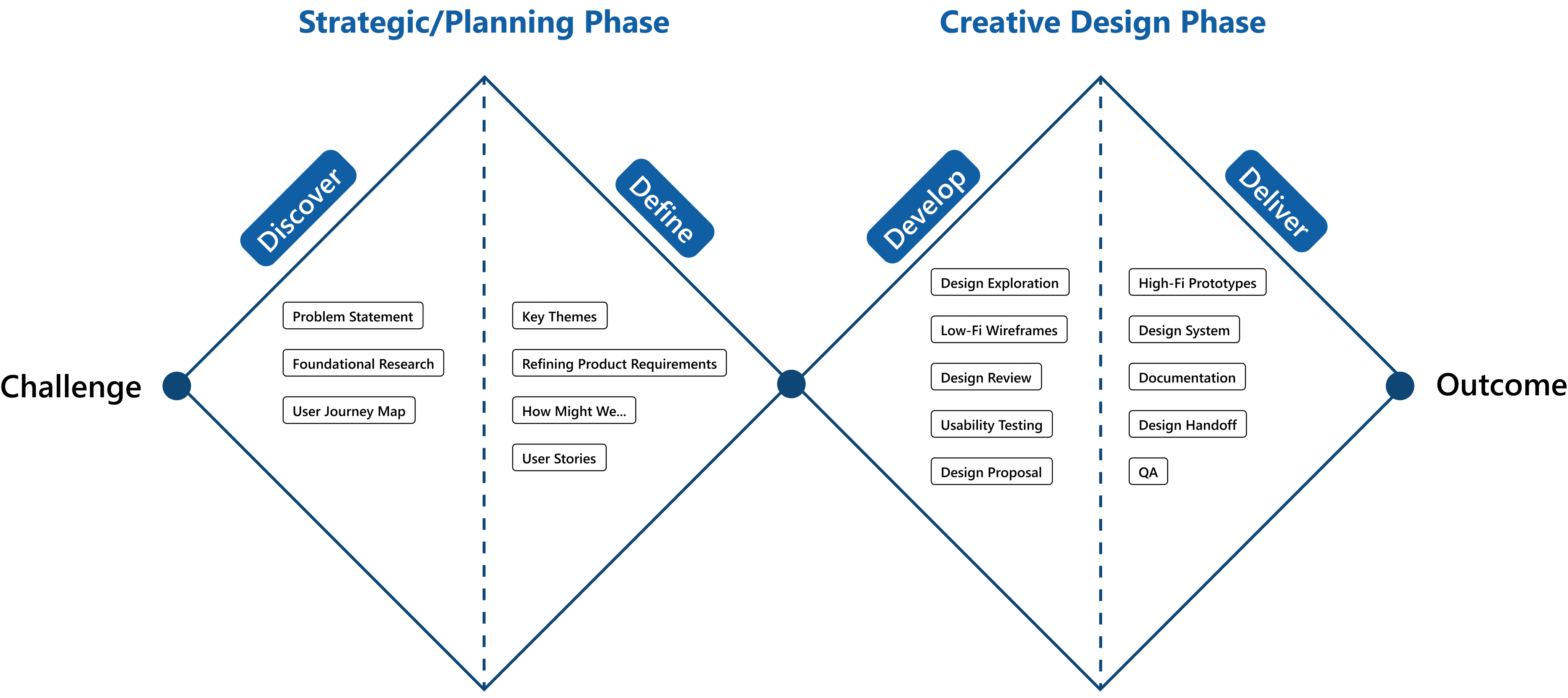
Double Diamond UX Design Process
At the outset of the project we adopted the Double Diamond model as our design approach.
During the first stage (1st diamond: strategic/planning phase), we ought to identify the problem we needed to solve (Discover) and determine the area to focus on (Define).
The second stage (2nd diamond: creative design phase) involved exploring potential solutions (Develop) and implementing solutions that proved effective (Deliver).
RESEARCH & USER NEEDS
The Discovery
Foundational research: gather user insights
We conducted user survey and interview after the first phase launch. These are the key user insights that could drive our planning phase:
Time Sensitive Working Style
Financial professionals work in a time-sensitive manner and seek ways to save time in tracking their email communication with clients through TRIYO.
“I think more information needs to be displayed at a glance. Many scrolling action is inefficient to me”
Tell Me What Are the Updates
User expect to quickly capture what’s being updated in Audit Trail for a task.
“When I open the Audit Trail, the first thing I want to see is what’s being updated for this task.”

Quickly Locate Important Information
Users only want to see important emails that are relevant to them on Audit Trial, without having to go through multiple email entries repeatedly.
“Sometimes, I need to read many important emails over and over again. Could you imagine having a email thread with 50 emails back and forth, and I have to find them one by one?”
Less Effort to Read
Audit trail is a text-heavy page. Users want to read the Audit Trail with less cognitive load while still capturing all the important information.
“When a task having many emails loaded onto its Audit Trail and I scanned through the emails, sometimes I would accidentally skipped a line and I have to come back to read again.”
Responsive Layout Issue
The layout was not adaptable to accommodate varying sizes. When users resized the Audit Trial, certain components would break into separate lines or collide with one another.
“Some text ends up getting truncated.”
The Problem
Poorly organized Audit Trail screen harms productivity
Financial professionals rely on the Audit Trail function to keep track of and manage email communications associated with specific tasks. However, they encounter difficulties due to the limited screen size of the add-in and the disorganized interface. These problems include the problems of excessive scrolling, poor readability, layout issues, and a lack of efficient ways to locate important information. As a result, users experience frustration and wasted time due to these challenges. This leads to the question,
"…how might we help Financial Professionals use Audit Trial more effectively?"

A user journey map of financial professionals locating the desired email in Audit Trail
Ideation Phase
How might we…
After the problem identified, we entered ideation phase. We have confirmed 3 main paths to enhance the Audit Trail and come up with a wish list of all the different features. We focused on coming up with as many ideas as possible. Focus on the quantity not quality.
HMW…help users quickly locate the specific entry users want to look at in a time-efficient manner.
Categorize based on AT (Audit Trail) entry types (e.g. system notification, emails)
Date range filtering
Filtering AT by users
Filtering AT by user roles
Filtering AT by entry status
Filtering by different email threads
Filtering by entry types
Save / favorite list of entries
Search by keywords
Pin the important entries at the top
Sorting entries in order
HMW…maximize the usage of the limited add-in screen.
Entry exceeding a certain number of rows will be truncated.
Have collapsible and expandable comment module
Optimize the space used by the Audit Trail header.
Allow users to hide certain date ranges of the AT entries
HMW…inform users of the latest update.
Highlight the latest update
keep the latest update at the top (first thing see when users open the Audit Trail)
Inline notification informing users the latest updates
Shortcut to quickly scroll to the latest update
HMW…make Audit Trail more user-friendly.
Give helper tips for actions that could be taken within Audit Trail
Improve the responsiveness of the Audit Trail screen
Scoping the solution
Define
Success Metrics
After meeting with the product manager, we have defined several success metrics for the project.
Keep Existing Functions: The existing functions of TRIYO AT should remain in the new design.
Minimize Unnecessary User Actions: Reduce the number of clicks required for users to achieve their goals within the AT
Intuitive and Efficient to Use: Financial professionals often work in a time-sensitive manner. We should provide easy-to-use user interface for them to efficiently locate the information they want.
Maximize On-screen Information: Maximize the amount of information presented to users on a small add-in screen.
Scope & Feature Prioritization
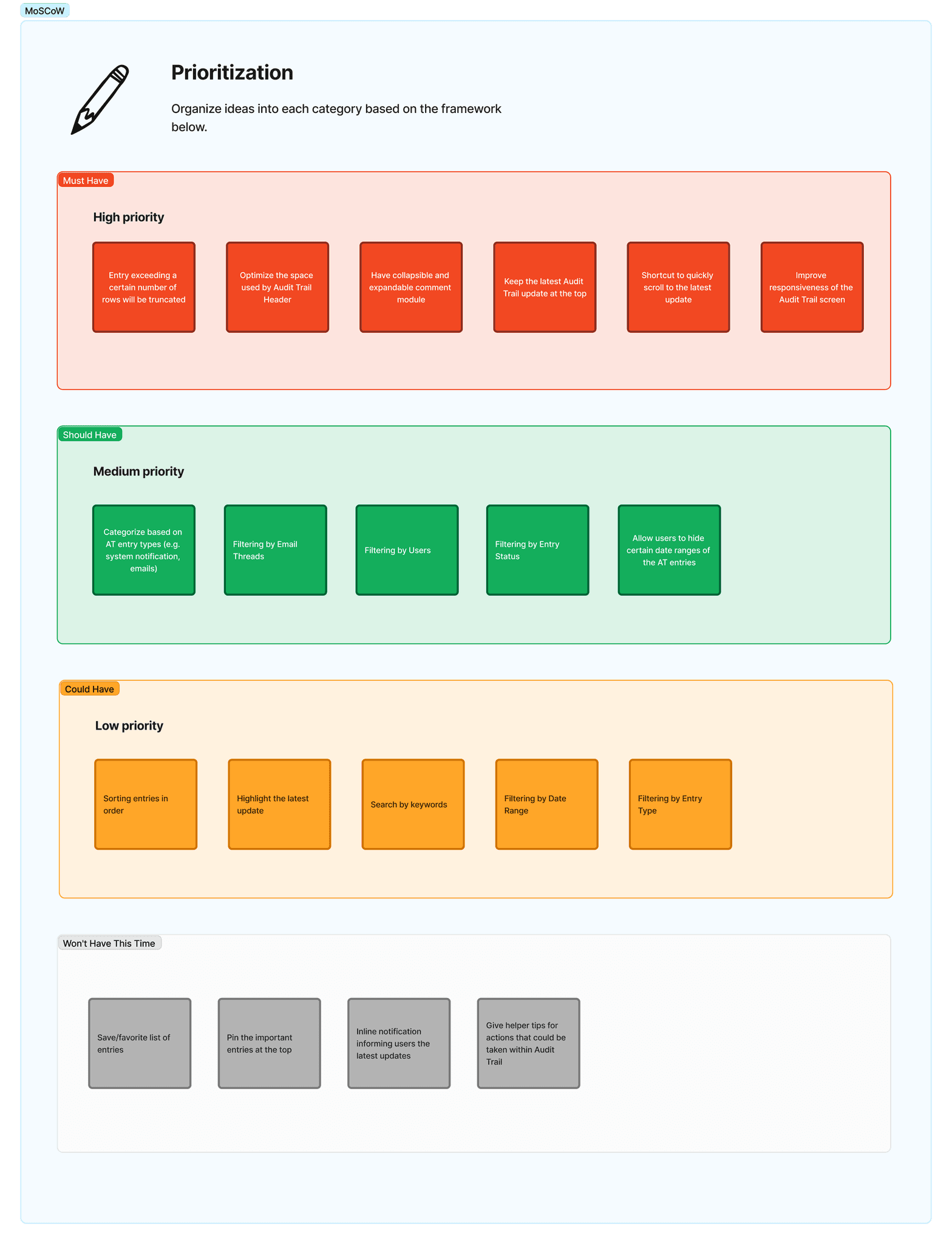
With the success metrics in mind and the wish list of potential features, we did a feature prioritization to understand and manage priorities. It helped us quickly narrowed down the scope of this project during the limited time frame.
Firstly, we invited all the stakeholders to collaborate with us using MoSCow (Must Have, Should Have, Could Have, Won't Have this time) framework to group the features based on user requirements.
Next, we engaged with Developer Team and Product Team to score the 'Value' and 'Effort' for each feature in a 1-10 scope (Left), and plot the features using Effort vs. Value matrix (Right). Then, we visualize all the features in our bucket in 4 quadrants:
Quick Wins: features plotted under this quadrant require low effort but have high returns. Those features will be picked up first.
Big Bets: features under this quadrant require high effort but also have high value.
Maybes: these features provide limited value but also require minimal effort, which can be tackled when there are spare resources or as fillers.
Time Sink: These initiatives demand significant effort but also provide minimal value. They should be avoided.
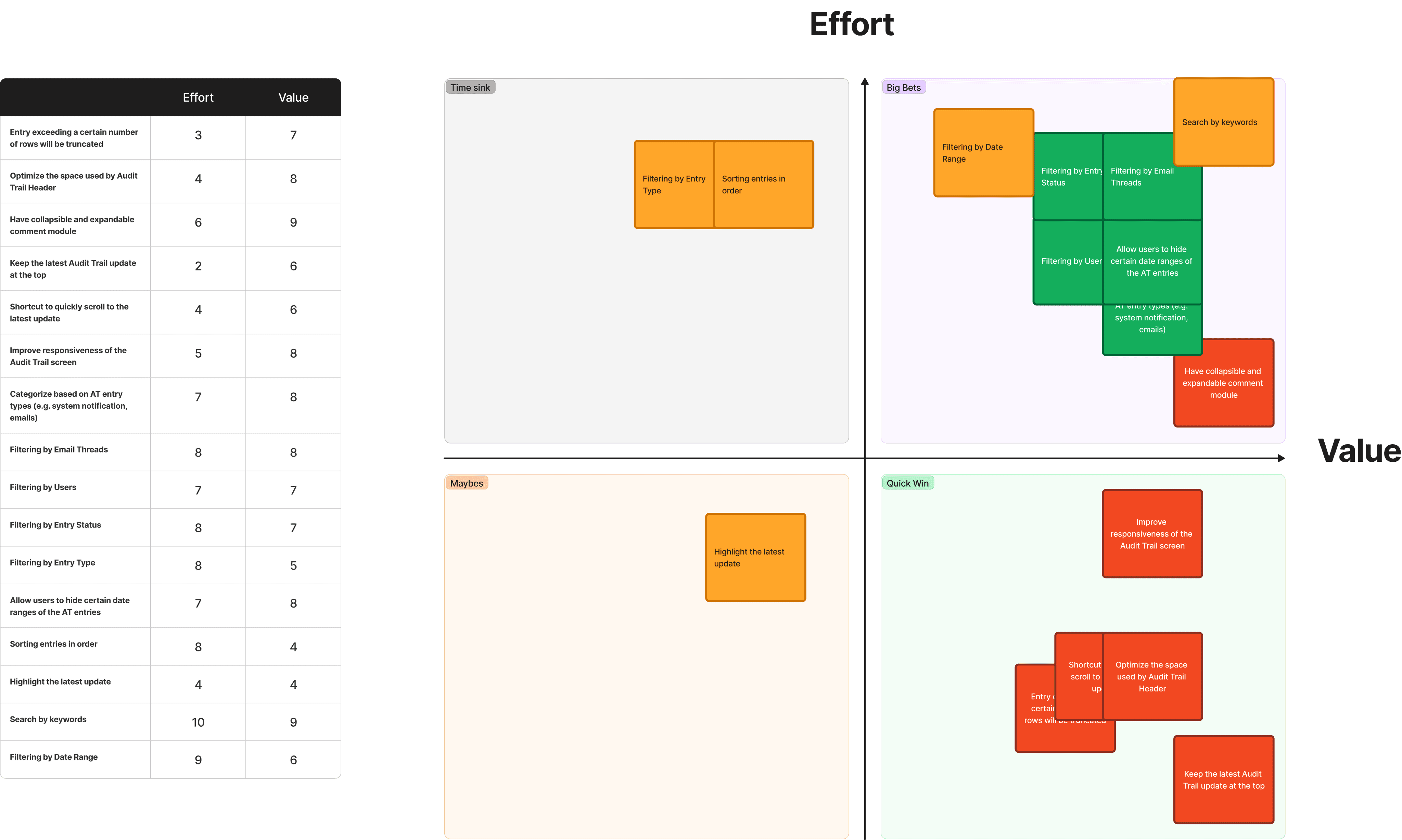
After prioritizing the features, we decided to focus on the "Quick Wins" given our limited delivery time. We aimed to address as many "Big Bets" features as possible along the way. Features categorized as "Maybes" were considered during any available downtime, while "Time Sink" features were excluded from the scope of this project.
ideations & design
Wireframes
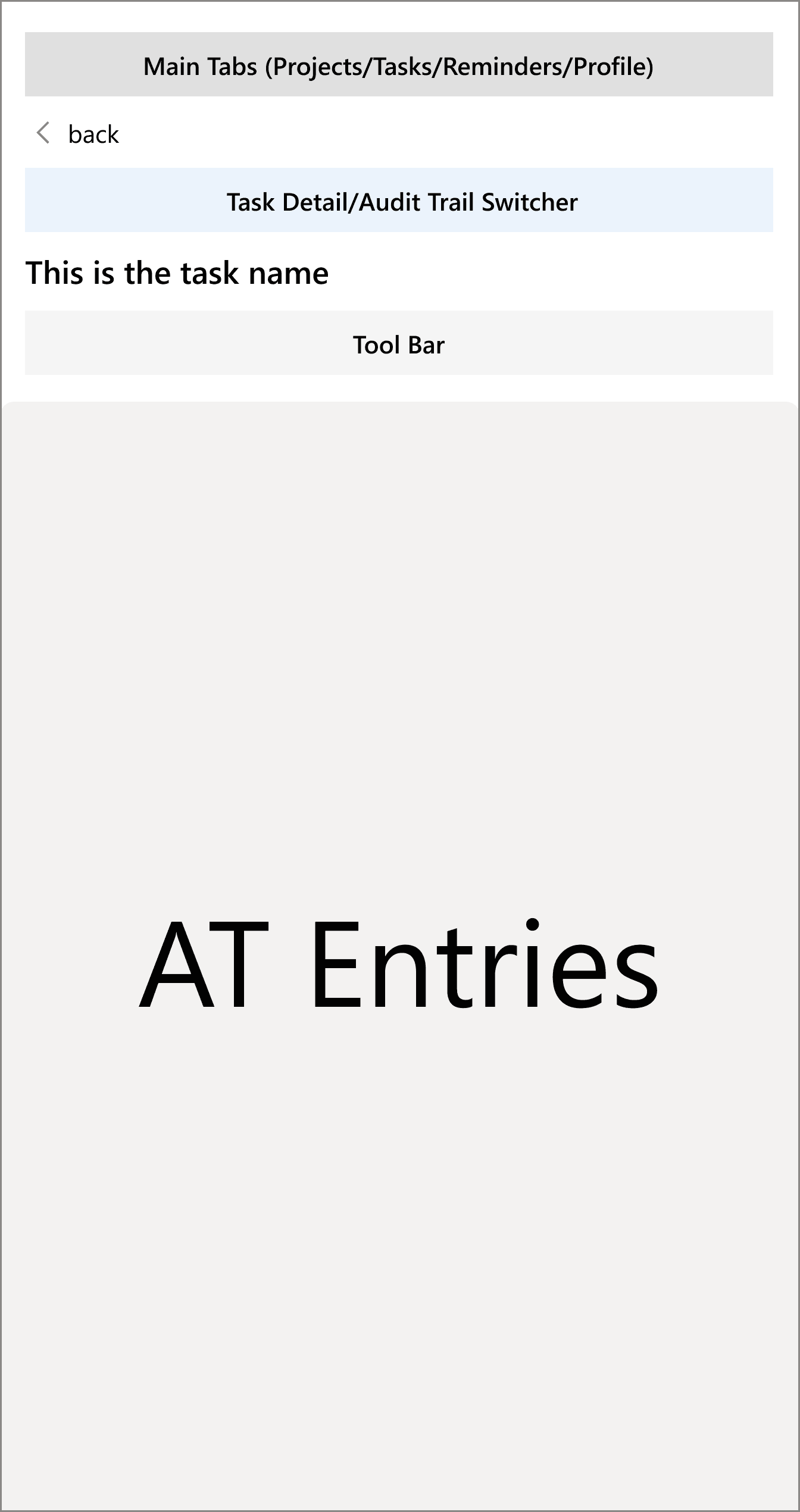
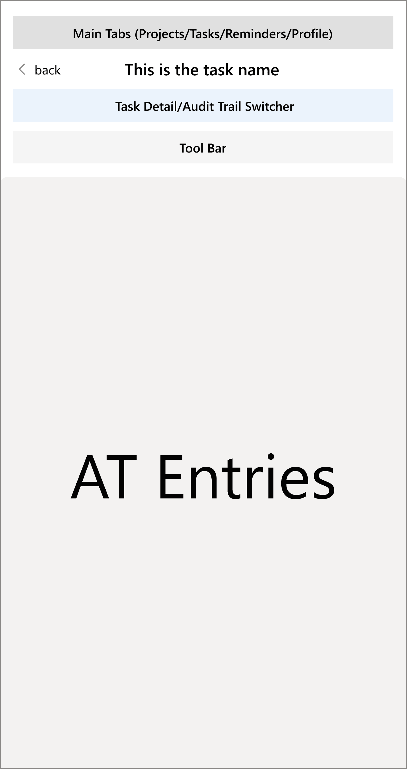
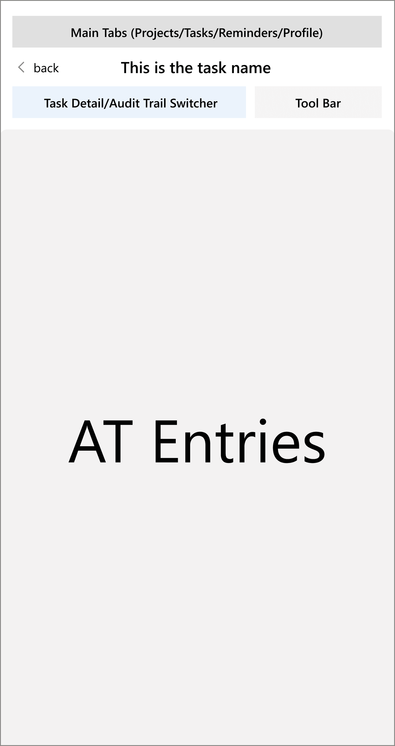
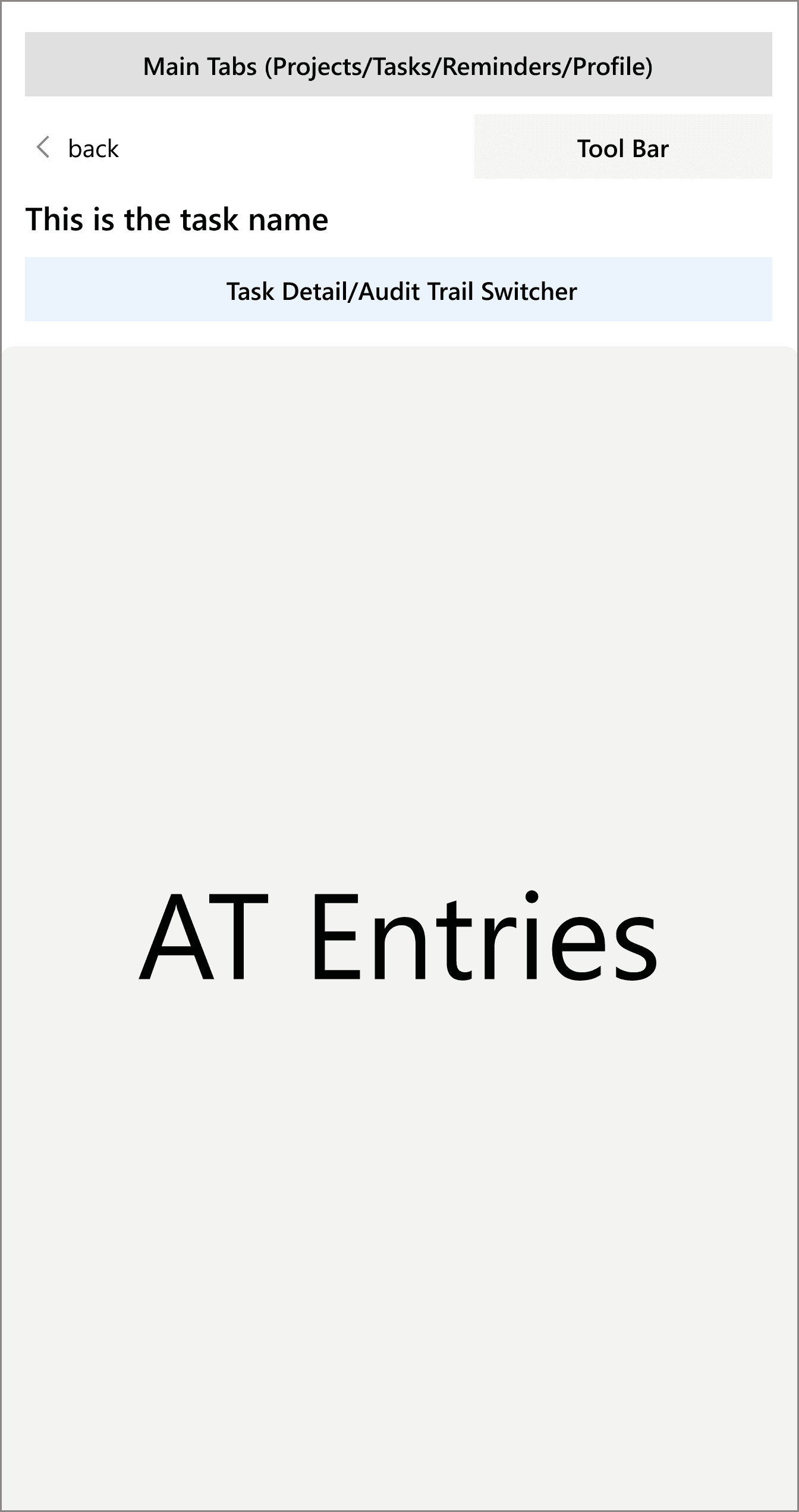
In the wireframing phase, we divided the Audit Trail Screen into two major UI regions: Header and Main Content Area.
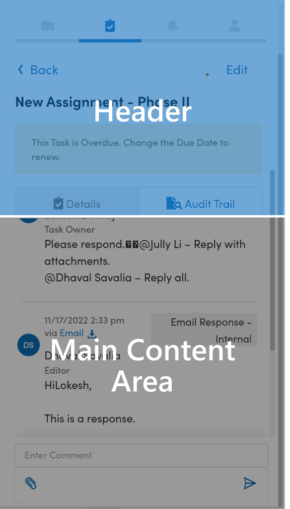
Within each region, we further broke each region into elements. In the redesign, we wanted to keep all the essential elements (Global Navigation, Back Link, Task Name, Module Tabs) on Audit Trail and introduced a Tool Bar to the interface.
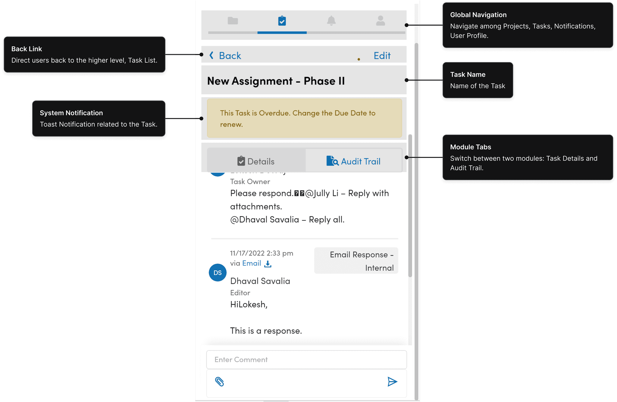
Header Elements
Explored different approaches to place the Header Elements.

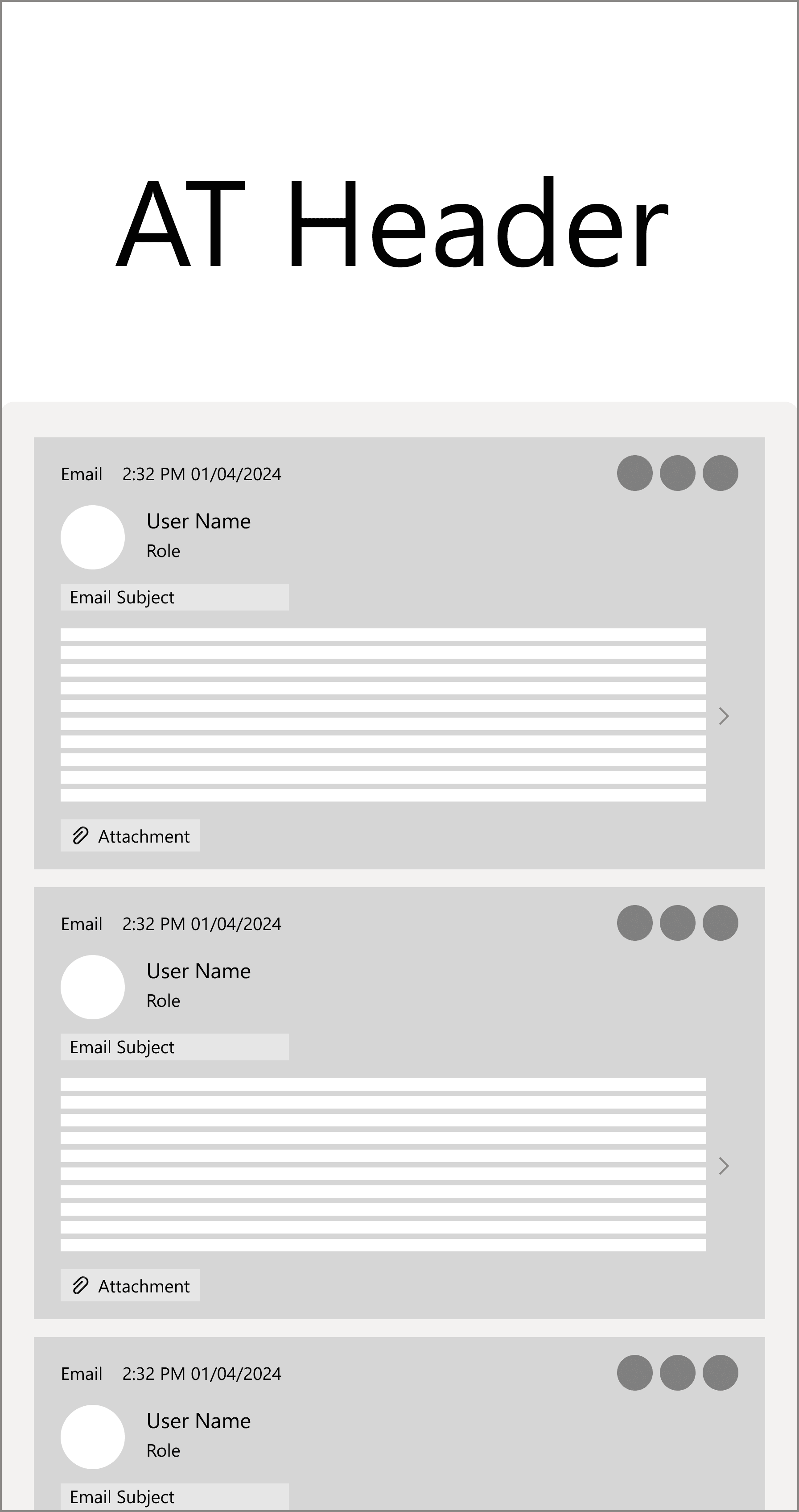
Header Wireframes
Similar to mobile interface, the size of the add-in screen is constrained. For the long list of Audit Trail entries under the task, we still adopted the cards to display the list of entry previews, and Infinite scrolling approach to load content continuously as the user scrolls down.

Main Content Elements
Before wireframing the Main Content Area, we asked ourselves two questions:
Financial Professionals should be able to quickly skim down the Audit Trail and understand what the task is about. At the same time, they might be also required to view the important entry (ex. email content) in more details.
The list of Audit Trail Entries could be very long.
The list is ordered by time.
Entries are text-heavy.
There are 3 main categories of entries: Emails, System Notifications, and Comments.
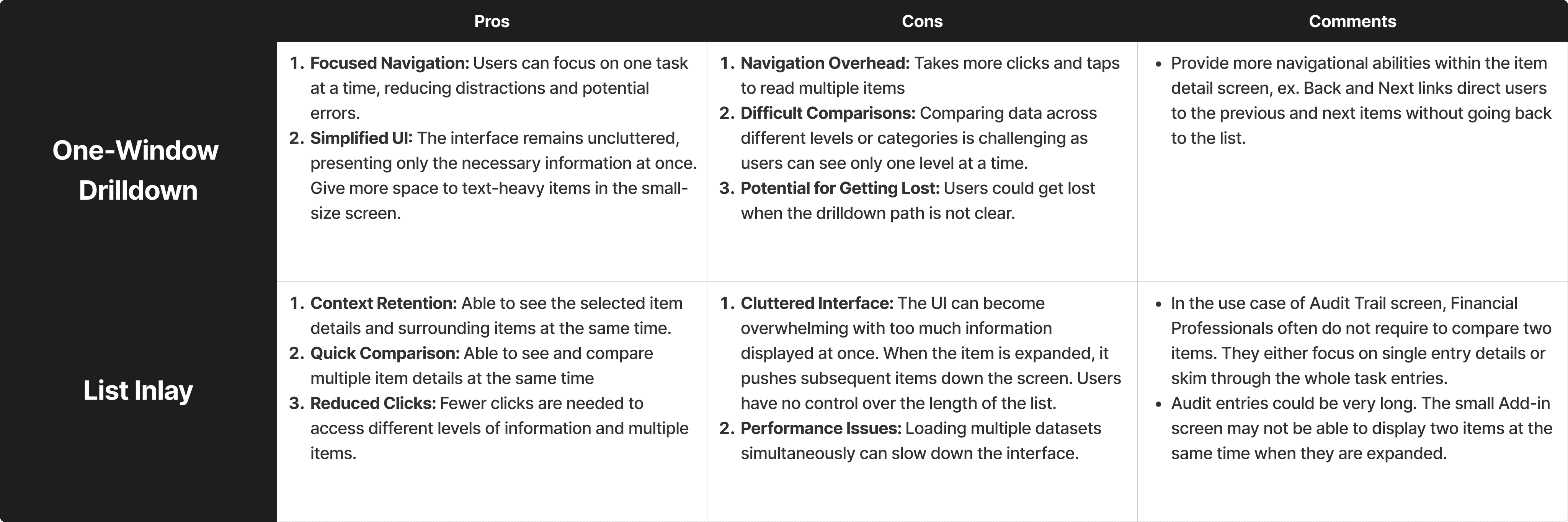
Next, we explored two approaches:
One-Window Drilldown
List Inlay
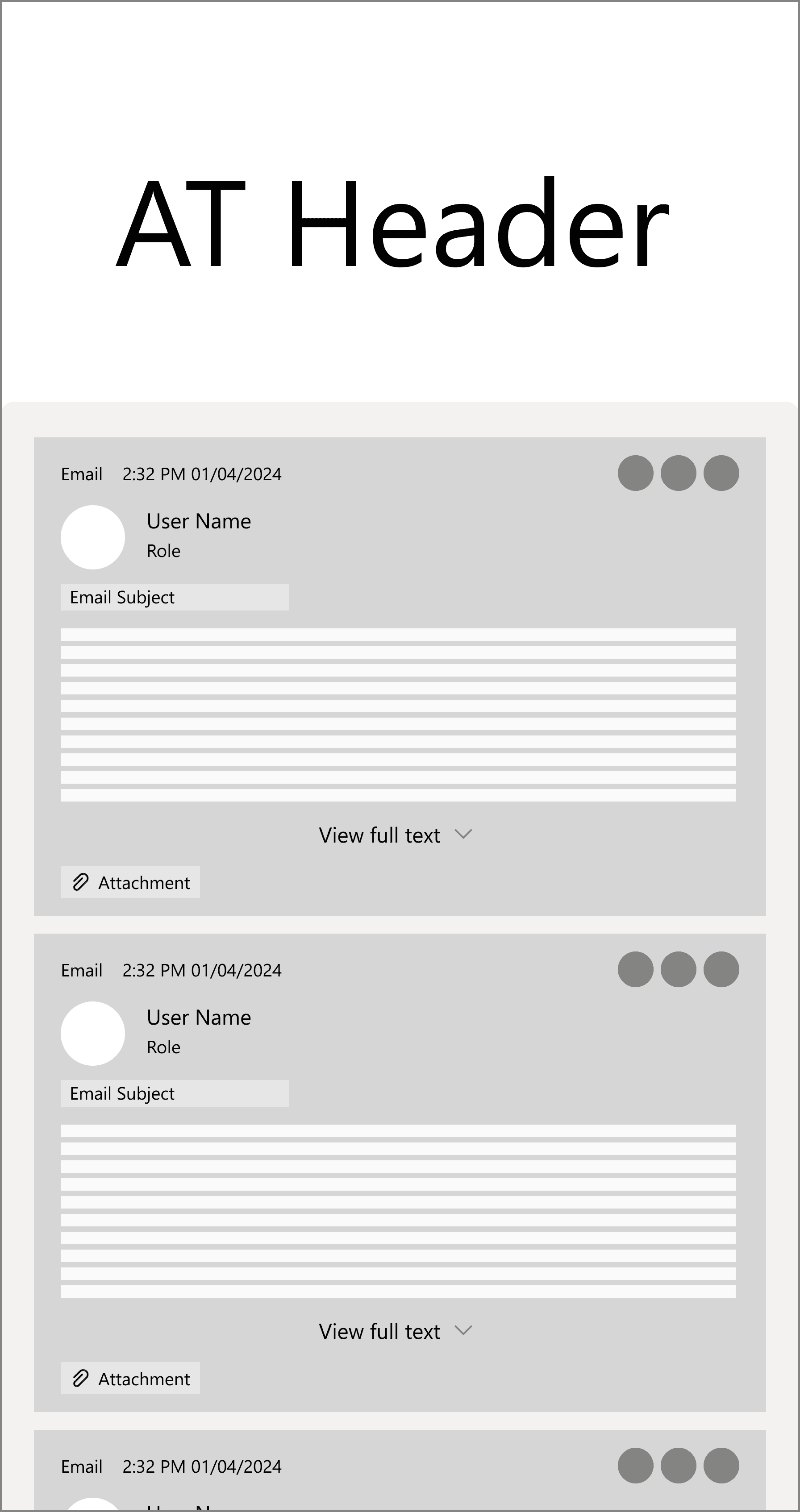
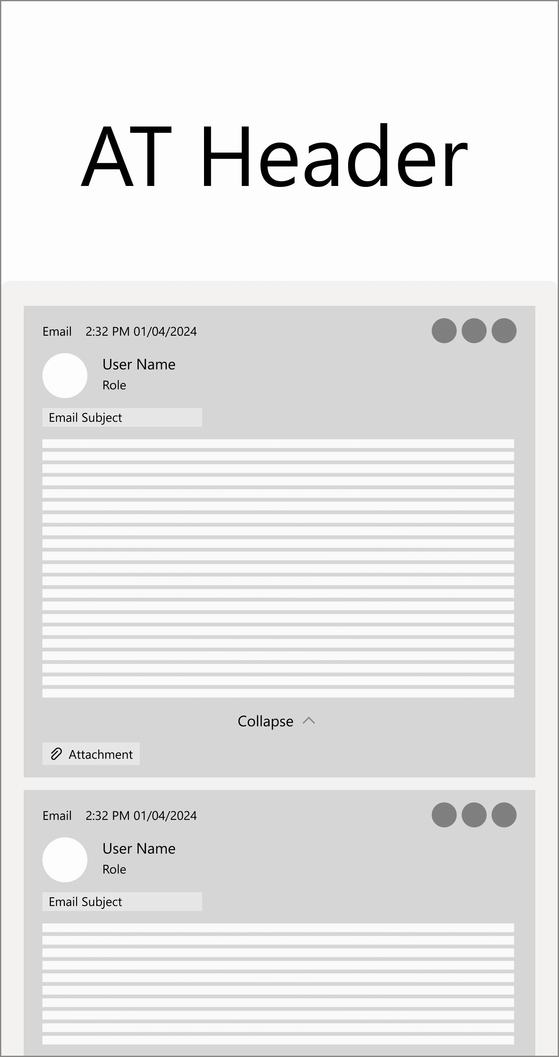
In List Inlay pattern, the entry detail view is embedded in the list itself. users are able to see both entry details and its surrounding entries.
In the first design review session, we compared two methods' pros and cons, and decided One-Window Drilldown would be more suitable for Audit Trail use case.
High-fidelity Prototype
Searching
Allow users to quickly locate specific entries by entering relevant keywords.
Filtering
Help users narrow down entries based on specific criteria. Users are able to apply various filters, email threads, members, activity badges, dates, allowing for a customized and focused review of AT.
Narrow down entries based on email threads. Users can easily trace communication related to specific email threads.
Filter by task members to view emails, comments sent out by specific individuals.
Quickly review entries tagged with specific actions or milestones, like 'Email Sent', 'Email Response - Internal', etc.
Narrow down entries by specific dates. Users are able to choose the specific dates on date picker.
Date Accordion
Allows users to collapse the dates they are not interested in viewing. Minimize the scrolling interaction required to review the desired content.
Comment
Comment floating button gives more space to the main content area. Users are able to launch the comment module by clicking the floating button and expand the comment box to make long text entry.
'Scroll to the Top' Button
The latest content is located on the top. When users scroll to the bottom, it provides a shortcut to scroll all the way to the top.
Different Types of Entry Cards
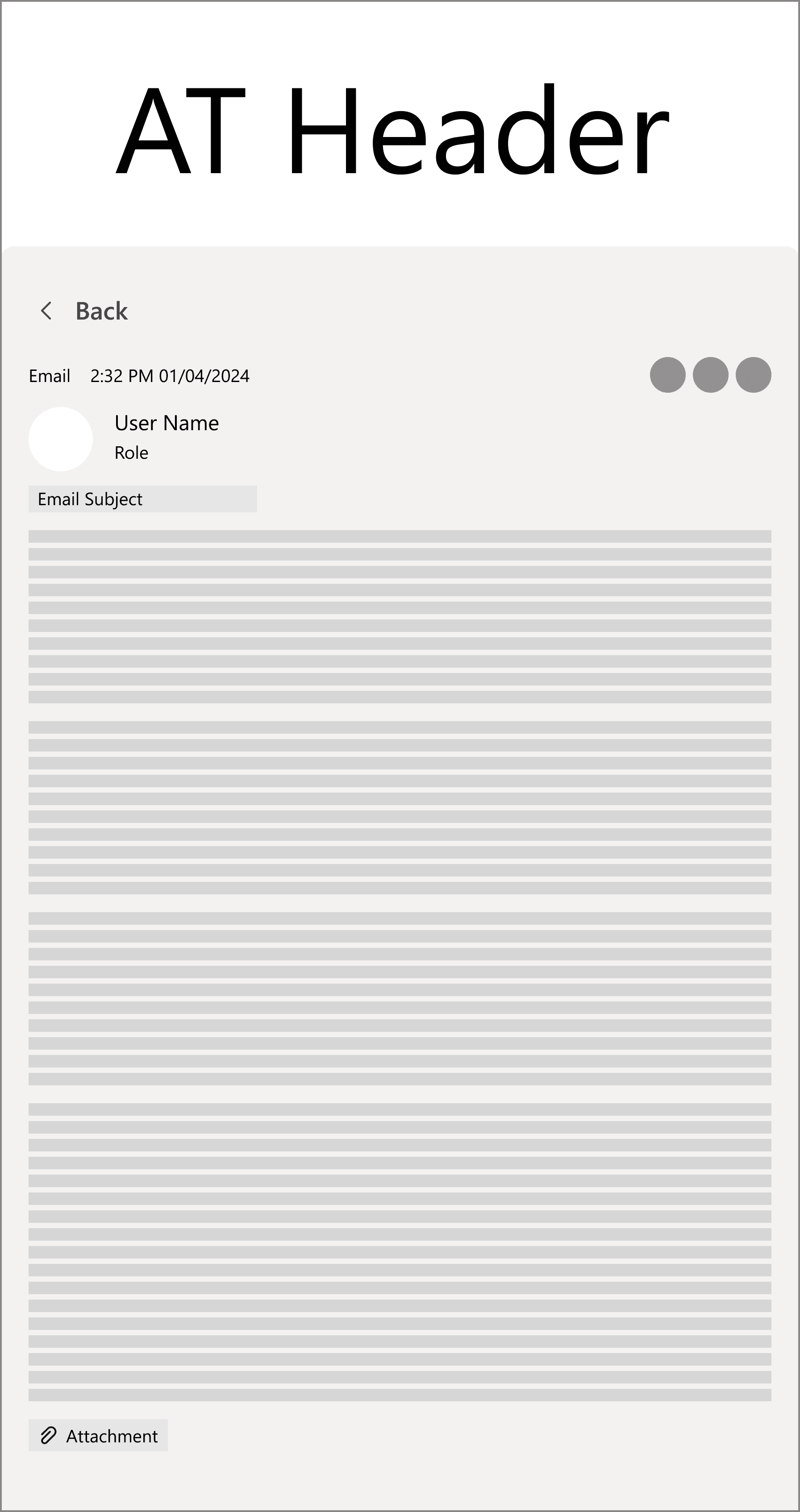
One Window Drilldown
Users are able to click into each Audit Trail card to see the full content in a separate window. In the detailed view, users could navigate to the previous or next entries. They will not get lost, because they could always go back to the Audit Trail List.
Outcome
Impact
Optimized User Experience
The redesign and UI enhancements of the Audit Trail in the TRIYO Outlook Add-in has had greatly boosted usability. The optimized screen layout has made navigation more efficient, while improved content readability enhances user experience. We've also added more tools to help users quickly and precisely locate the information they need. By aligning the UI with Microsoft's design language, the interface now feels more cohesive and integrated with Microsoft Outlook. Achieved 20% increase in user satisfaction.
"The improved readability has made working with the Audit Trail much less of a hassle"
"Navigating through the add-in feels smoother and more intuitive after the redesign."
"I love how the interface now feels like a natural extension of Outlook."
"The improved user interface allows me to quickly audit processes, saving valuable time."
“Optimized screen helps me focus on important messages without getting lost in the details.”
Next Step
Future enhancements
With the release of this version to users, we have outlined the next steps for enhancing the Audit Trail function. In the upcoming release, we planned to introduce additional features such as 'Sorting' and 'Saving Important Entries' to the users' toolbox, aimed at improving efficiency. We were also planning to integrate AI functionalities to provide a more robust and intelligent working experience.