Decoding Japan Spreading Trend: A COVID-19 Data Visualization Journey
Data Visualization, Graphics
Feb 2023 - April 2023
COVID-19, a highly contagious disease caused by the SARS-CoV-2 virus, triggered one of the most significant pandemics in human history. The outbreak confined people to their homes, isolating them from loved ones and disrupting daily life. In response, a surge of research emerged, delving into the virus's transmission dynamics and its global impact. This project seeks to bridge the gap between complex COVID-19 research and public understanding by leveraging visual storytelling to present key findings in an accessible and engaging way.
Background & Objective
In the summer of 2022, as a Biochemistry and Human Biology undergraduate, I contributed to research on COVID-19 transmission. Our study focused on data from Japan, spanning January to July 2020, to identify patterns that could inform strategies to prevent future outbreaks.
After graduating, I transitioned to a career in User Experience (UX) Design. One evening after work, I received exciting news: our research had been published in BMC Infectious Diseases.
Thrilled, I shared the link with my friends. My best friend, who has a financial background, responded, “That’s amazing! But… could you explain what this paper is about?” His question caught me off guard.
Scientific papers are often lengthy, dense, and filled with jargon. For most people, the technical terms, complex data analysis, and intricate graphics are intimidating, making the information inaccessible. As a UX Designer passionate about user-centered communication, I saw an opportunity.
How can I distill the key findings of our research into a form that’s engaging and easy for the public to understand?
Data Overview
In order to summarize the research, I started by identifying the key question the research was trying to tackle:
How do the superspreading potentials of COVID-19 differ among 5 different contact settings (Healthcare, Households, Workplace, Schools, Community) in Japan?
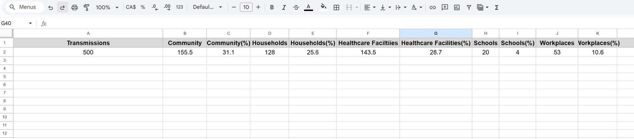
Next, I summarized the data from the paper using Google Sheet and did an overview:
WHAT
Where are infections Happening?
Who is spreading the Virus?
Risk of Superspreading by Settings
Who
Highly infectious infectors
Somewhat infectious infectors (causes 1>cases≤10)
Infectors did not spread any disease to others (causes >10 cases)
When
January to July 2020
Where
5 Different Contact Settings in Japan:
Healthcare
Community
Households
Workplaces
Schools
How Many
1017 Infectors
500 Transmissions
Then, I created a IA (Information Architecture) for all the important data that will be used for creating the final output, in order to understand its correlation.
Encoding Process
I started by sketching the data on paper. To guide my sketches, I followed principles like L.A.T.C.H. (Location, Alphabet, Time, Category, Hierarchy) and Gestalt, which helped me think about how to organize the information. I tried out lots of different ideas to see what would work best.
"Find a form that matches and marries the function of the data, and gives form to the stories that are hidden in the numbers, as well as communicates emotionally what these stories are. "
Valentina D’Efilippo (Data Designer)
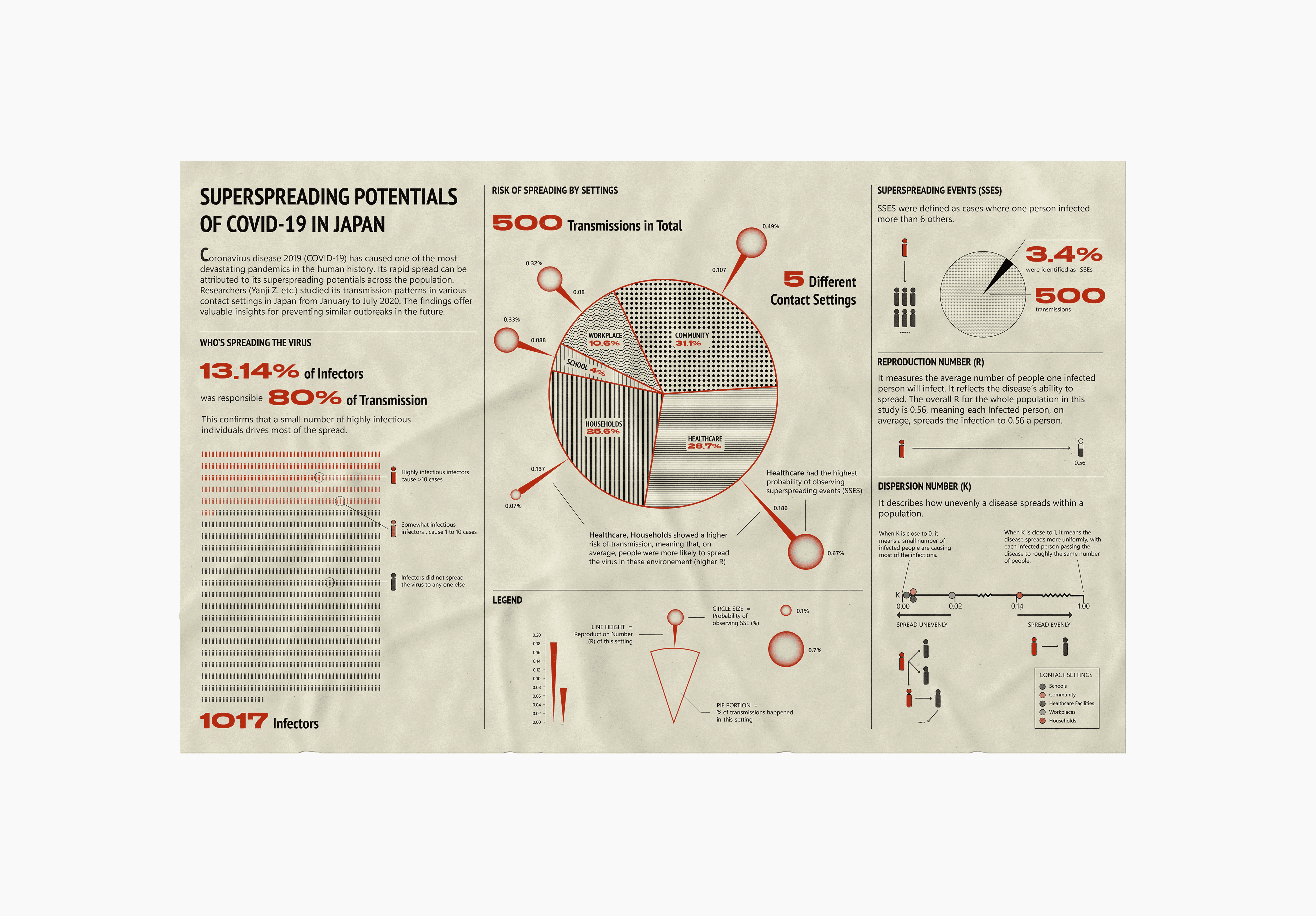
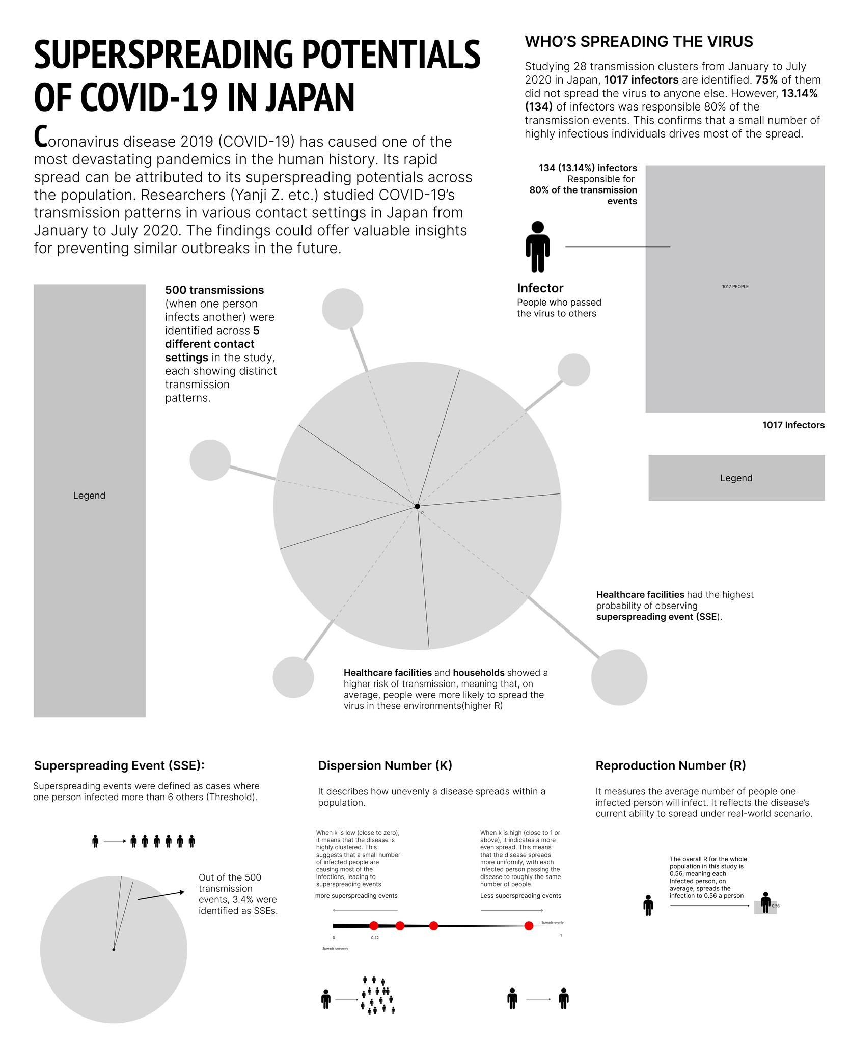
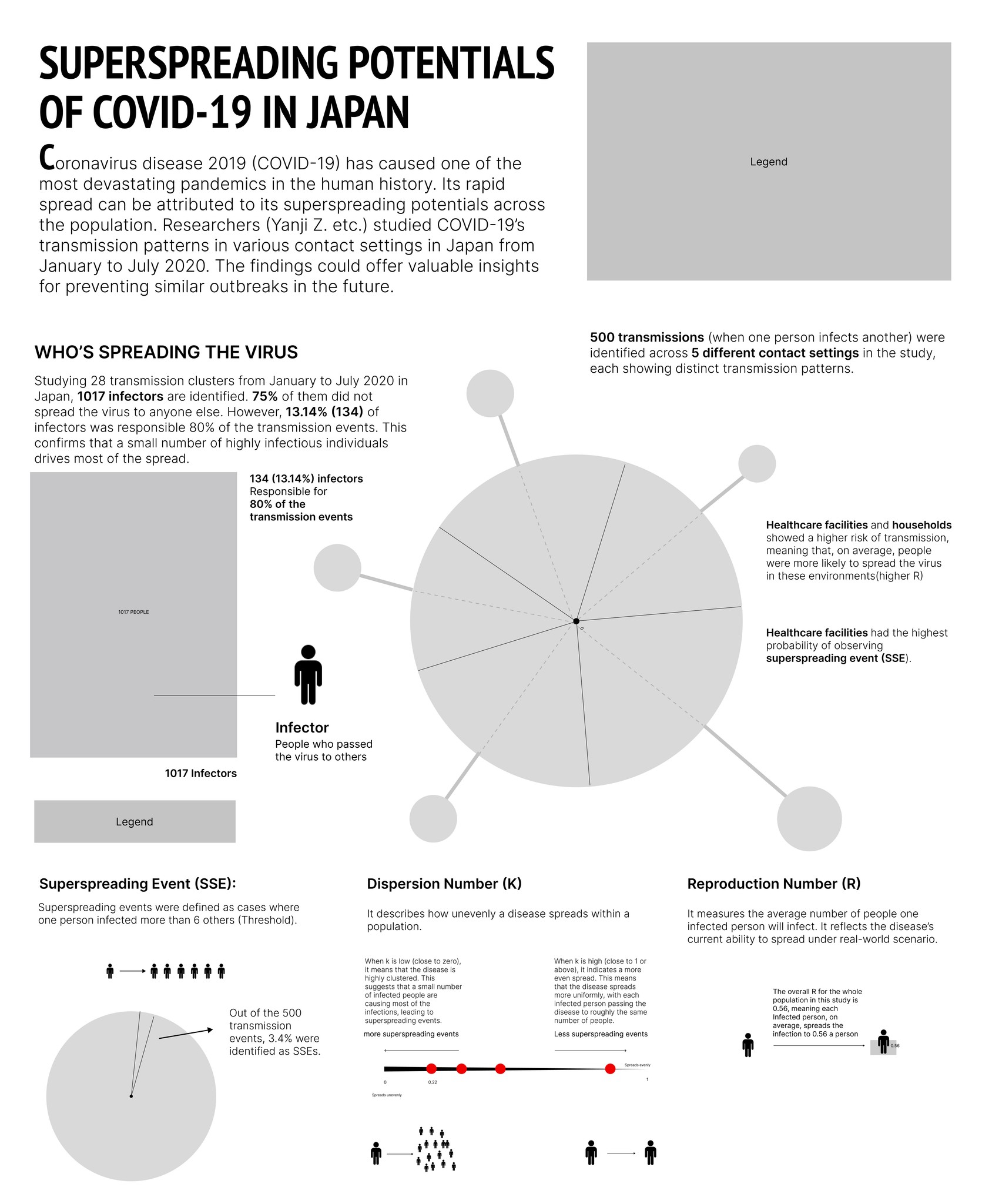
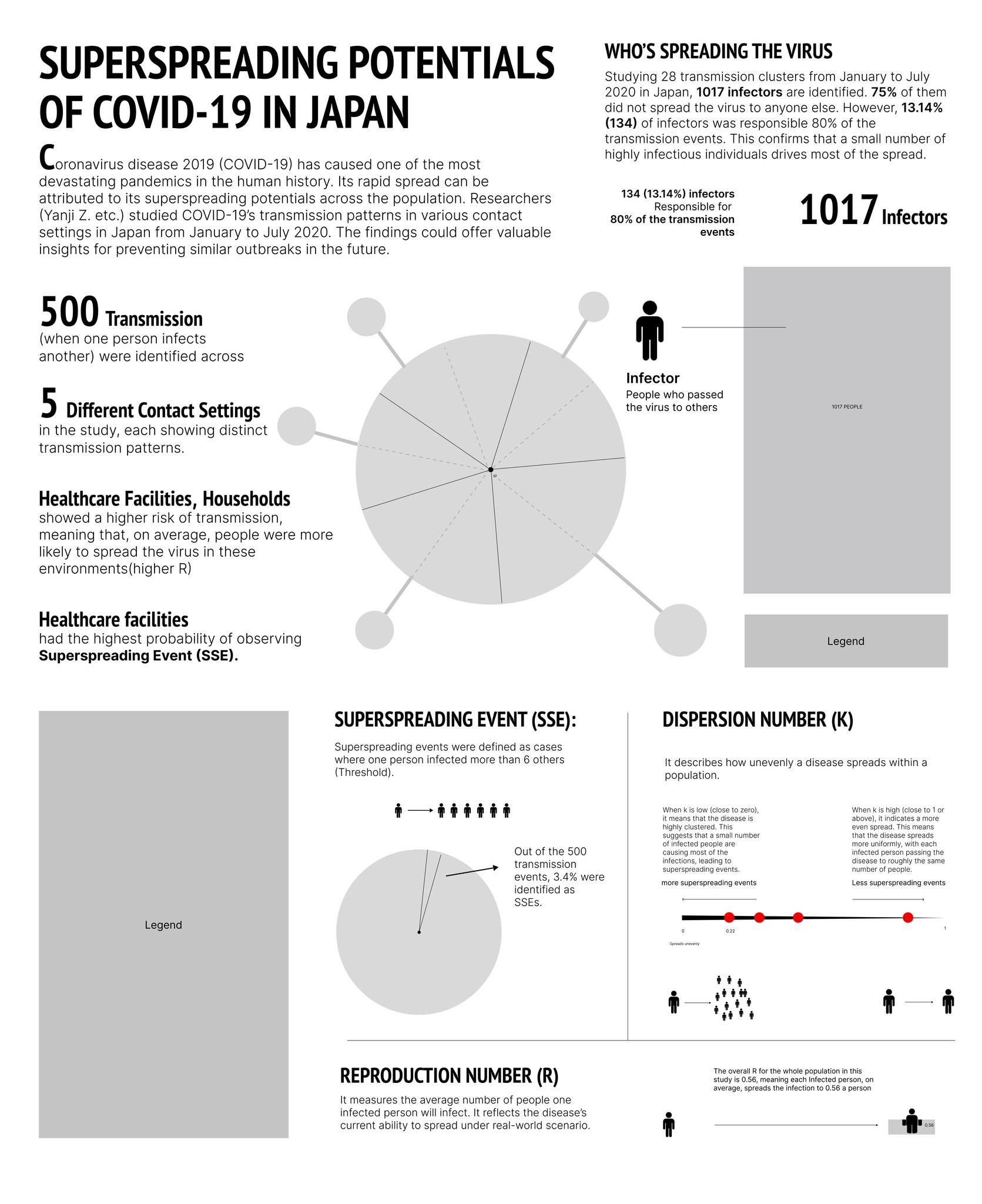
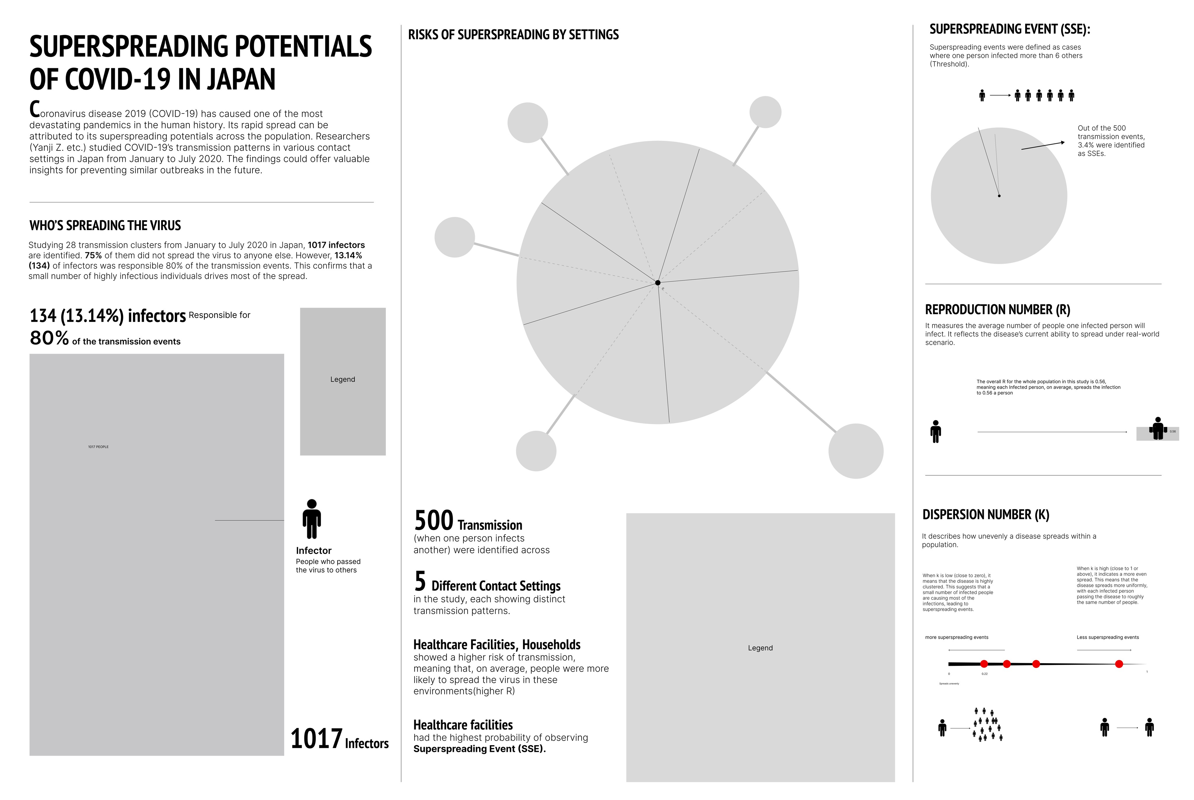
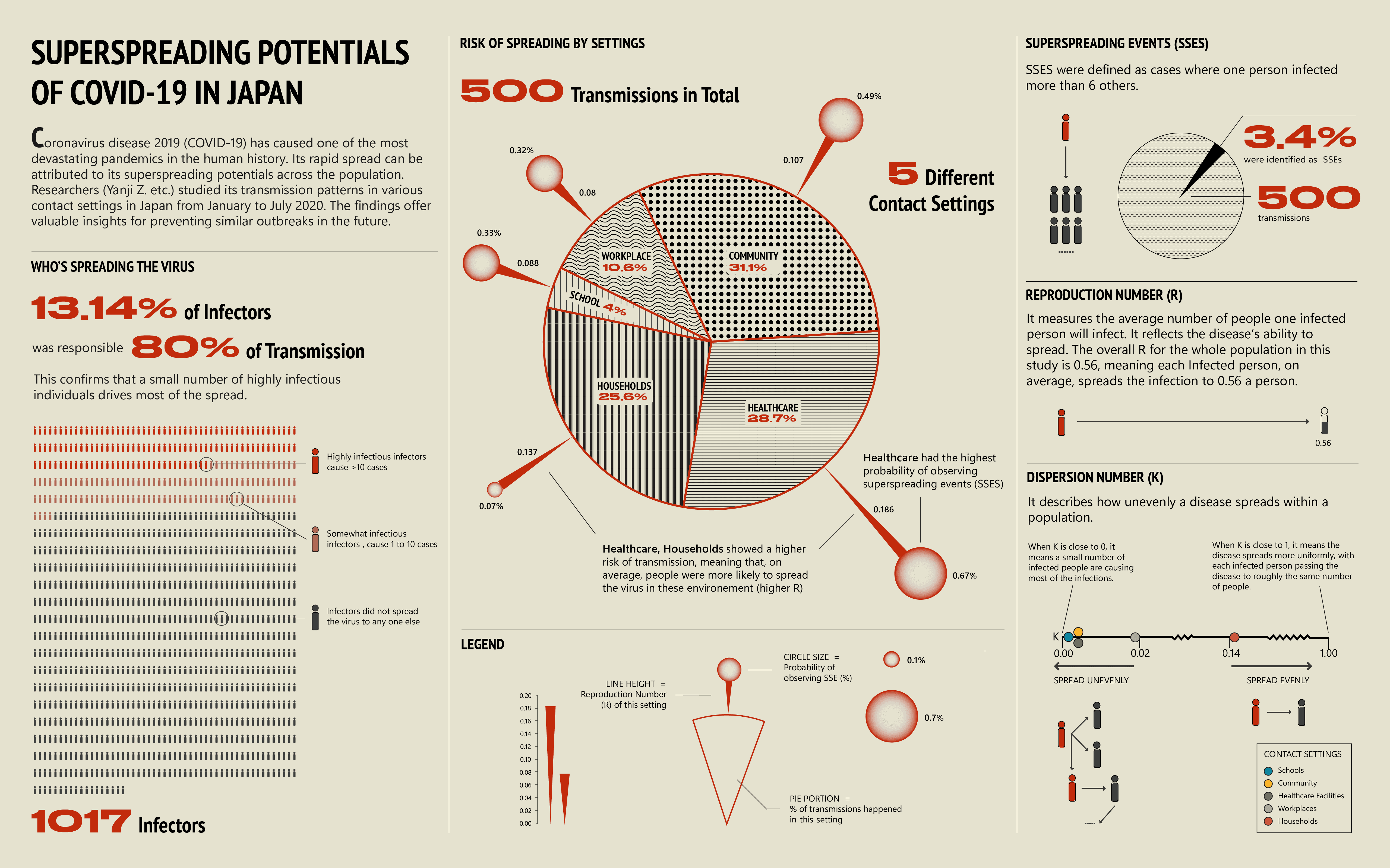
INFECTORS AND TRANSMISSIONS
When it came to showing the percentage of infectors and transmissions, pie charts felt like a natural choice.
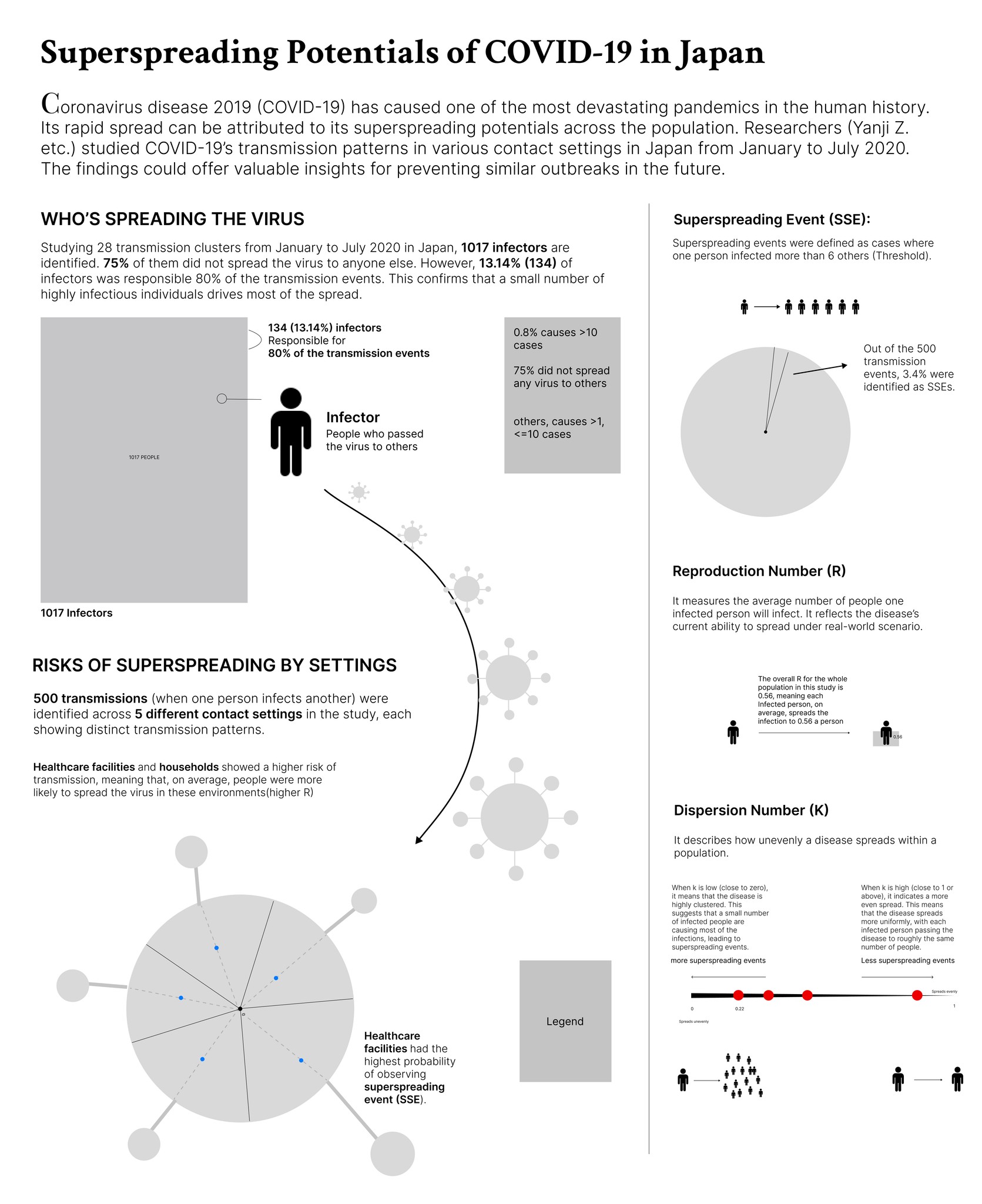
The top-left pie chart represents 1,017 infectors, while the top-right pie chart shows 500 resulting transmissions. Notably, 13.14% of infectors are responsible for 80% of the transmissions, highlighting the disproportionate role of certain individuals in spreading the virus.
The bottom-right pie chart breaks down the 500 transmissions by different contact settings, including Community (31.1%), Healthcare (28.7%), Households (25.6%), Workplaces (10.6%), and Schools (4%).
KEY PARAMETERS
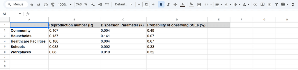
There are three key parameters for measuring the superspreading potential of COVID-19:
Superspreading Events (SSEs): Defined as cases where one person infects more than 6 others.
Reproduction Number (R): Measures the average number of people an infected individual transmits the virus to.
Dispersion Parameter (K): Describes how unevenly the disease spreads within a population. A low K (close to 0) indicates highly clustered transmission, while a high K (close to 1) suggests a more uniform spread.
To visualize the data for all three parameters across five different contact settings, I created a bubble chart. The x-axis represents K, and the y-axis represents R. The bubble size indicates the likelihood of observing SSEs in each contact setting, with different colors distinguishing the settings.
At first glance, understanding the bubble graph(above) and text for each parameter can be challenging. To improve clarity, I explored using simpler visuals with minimal text, aiming for immediate comprehension. Here's what I sketched:
SSE (Superspreading Events): I used a person icon to illustrate that when one person infects more than six others, it qualifies as an SSE. Additionally, a pie chart shows that 3.4% of the 500 recorded transmissions were classified as SSEs.
R (Reproduction Number): I adopted a pictorial percentage chart to show that when R = 1, it means one person, on average, infects 0.56 individuals.
K (Dispersion Parameter): This value ranges from 0 to 1. A lower K (closer to 0) indicates that a small number of individuals are responsible for most transmissions, leading to superspreading events and uneven disease spread. In contrast, a higher K (close to 1) suggests a more uniform spread, with each infected person transmitting the virus to roughly the same number of people, making superspreading events less frequent.
Is there a way to weave the visuals into a cohesive story?
Visualize the data through virus anatomy

After forming an initial idea for presenting the data, I began considering how to connect the elements into a cohesive narrative.
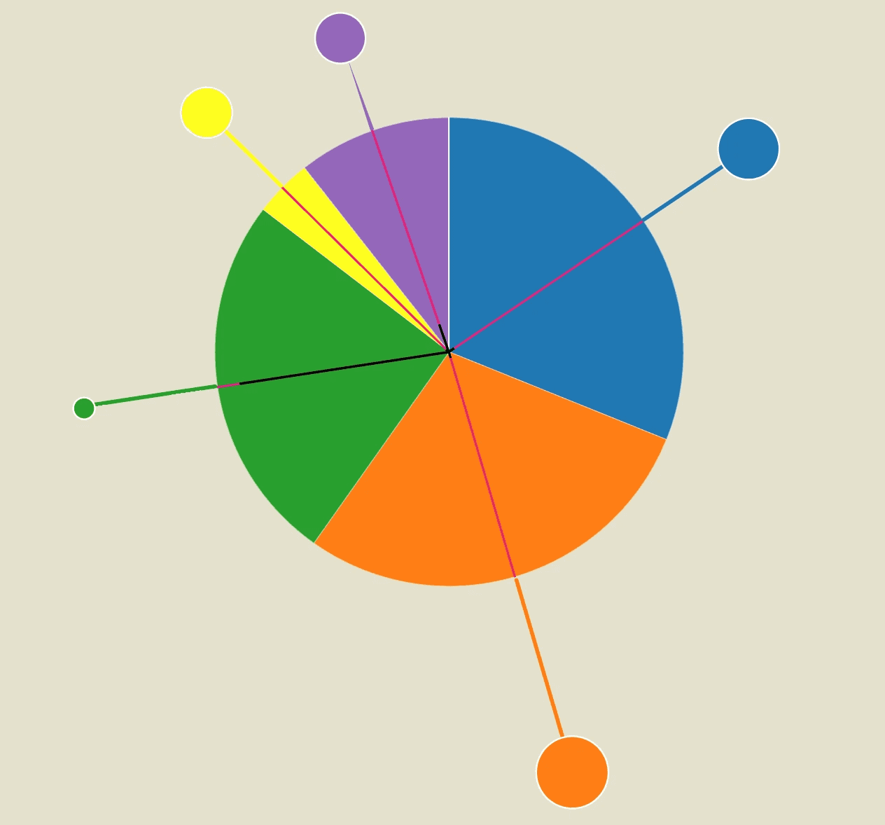
Since pie charts are the main visuals I used, their round shape reminded me of the central body of the viral structure.
With this in mind, I envisioned using the Coronavirus as the central framework, fitting the data into its structure to make it more clear and engaging.
The central body of the virus is represented by a pie chart, showing the distribution of transmissions across five different contact settings.
Each segment of the pie is connected to a "spike protein" extending outward, perpendicular to the arc of the segment. The length of each spike protein represents the R value for that setting, while the size of the spike protein’s head illustrates the percentage of superspreading events (SSEs) observed.
Additionally, the K value is depicted as the distance from the center of the virus to the midpoint of each pie segment
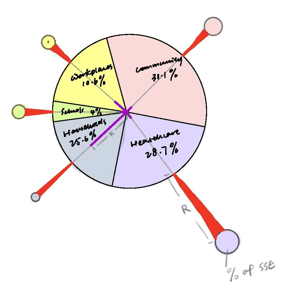
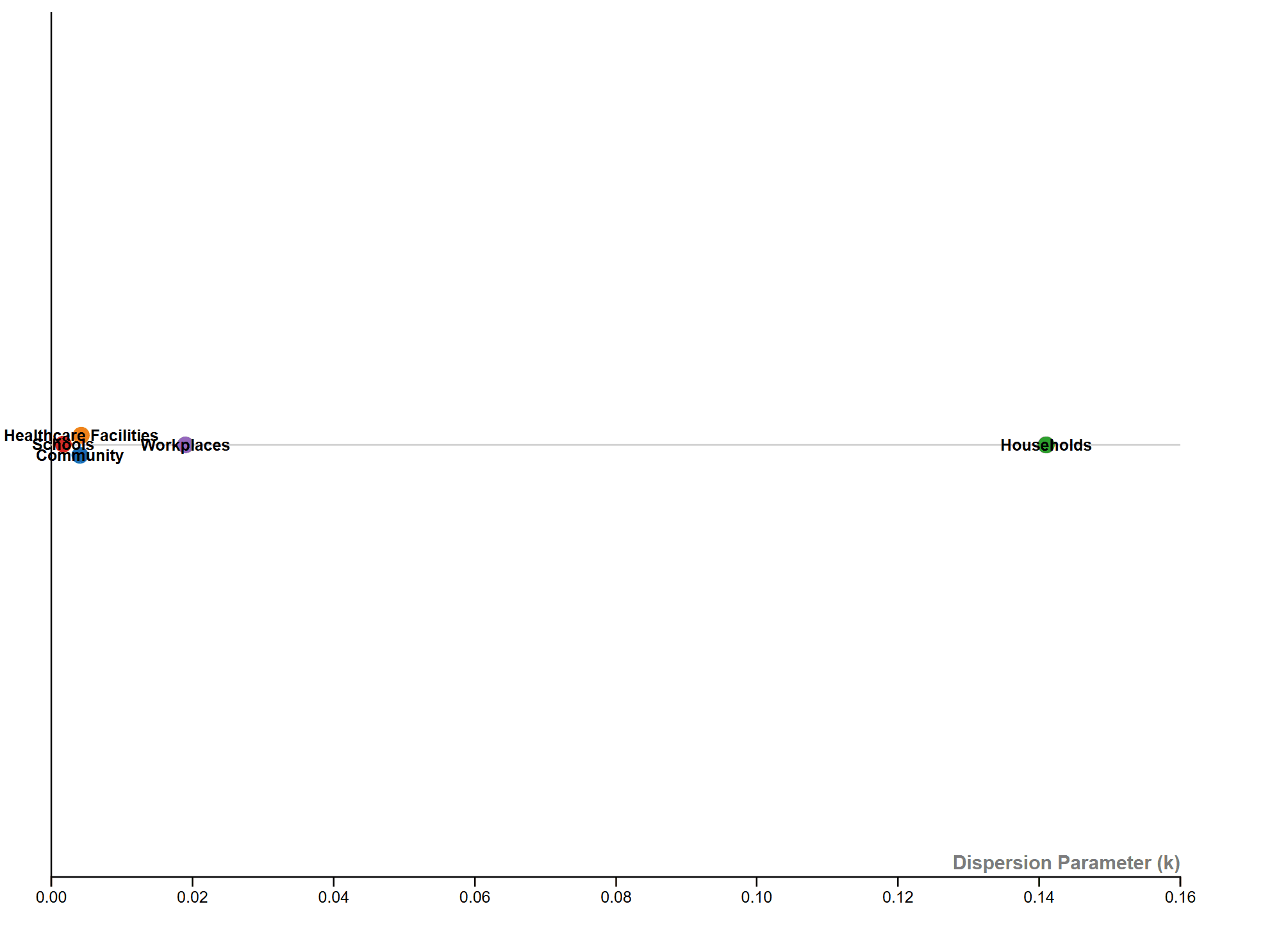
After plotting the data into calibrated graphs, I quickly realized that the K value (black line) was difficult to compare and visualize due to the large discrepancies between different settings.
For example, the K value for schools was so small that it was almost impossible to display clearly. As a result, I decided to set this parameter aside and create a separate section dedicated to visualizing it more effectively.
The solution was to use the original method of comparing K values across different contact settings on a linear scale, visualized using RAWGraphs.
However, I noticed that the K value for households was significantly higher than the others, causing the scale to stretch too wide and resulting in the other data points clustering tightly together. I noted that we might consider narrowing the numeric scale in the final graph between Households and the other data points to improve readability.
Wireframing
After constructing each building blocks, Next I have explored several different versions of layouts by wireframing.
Final infographic
Overall, the infographic is divided into three main sections:
The first section, "Who's Spreading the Virus," features a pictorial fraction chart in the final design, replacing the pie chart initially used during the sketching phase. Color is used to distinguish between the three groups of infectors, effectively emphasizing the disproportionate impact of a small number of individuals on transmission dynamics.
The second section, "Risk of Spreading by Settings," adopts a "virus anatomy" framework, where the R value determines the length of the "spike proteins" and the percentage of observed superspreading events. Legends and annotations provide clear references, allowing audiences to compare the data easily.
The final section on the far right outlines three key parameters—SSES, R, and K—that are critical in measuring superspreading potential in the research.
References
Robinson, Andrew Cornell. LATCH-Methods of Organization. Accessed Oct 23, 2024. https://parsonsdesign4.wordpress.com/resources/latch-methods-of-organization/
Zhao, Yanji, Shi Zhao, Zihao Guo, Ziyue Yuan, Jinjun Ran, Lan Wu, Lin Yu, Hujiaojiao Li, Yu Shi, and Daihai He. "Differences in the superspreading potentials of COVID-19 across contact settings." BMC infectious diseases 22, no. 1 (2022): 936.